
| Time | Content |
|---|---|
| 10:00–10:30 | Drawing plots with ggplot2 |
| 10:30–11:00 | Exercise 1 |
| 11:00–11:30 | The Grammar of Graphics |
| 11:30–11:40 | Break |
| 11:40–12:10 | Exercise 2 |
| 12:10–12:30 | Drawing multiple layers with ggplot2 |
| 12:30–12:50 | Exercise 3 |
| 12:50–13:00 | Wrap up |
Materials
BDSI Workshop

🕙 Schedule
📑 Resources
🏋️♀️ Exercises
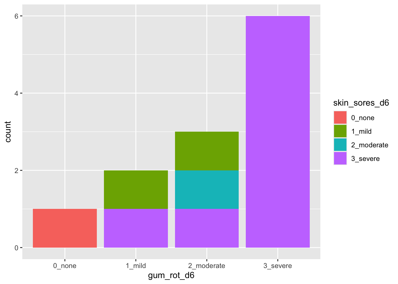
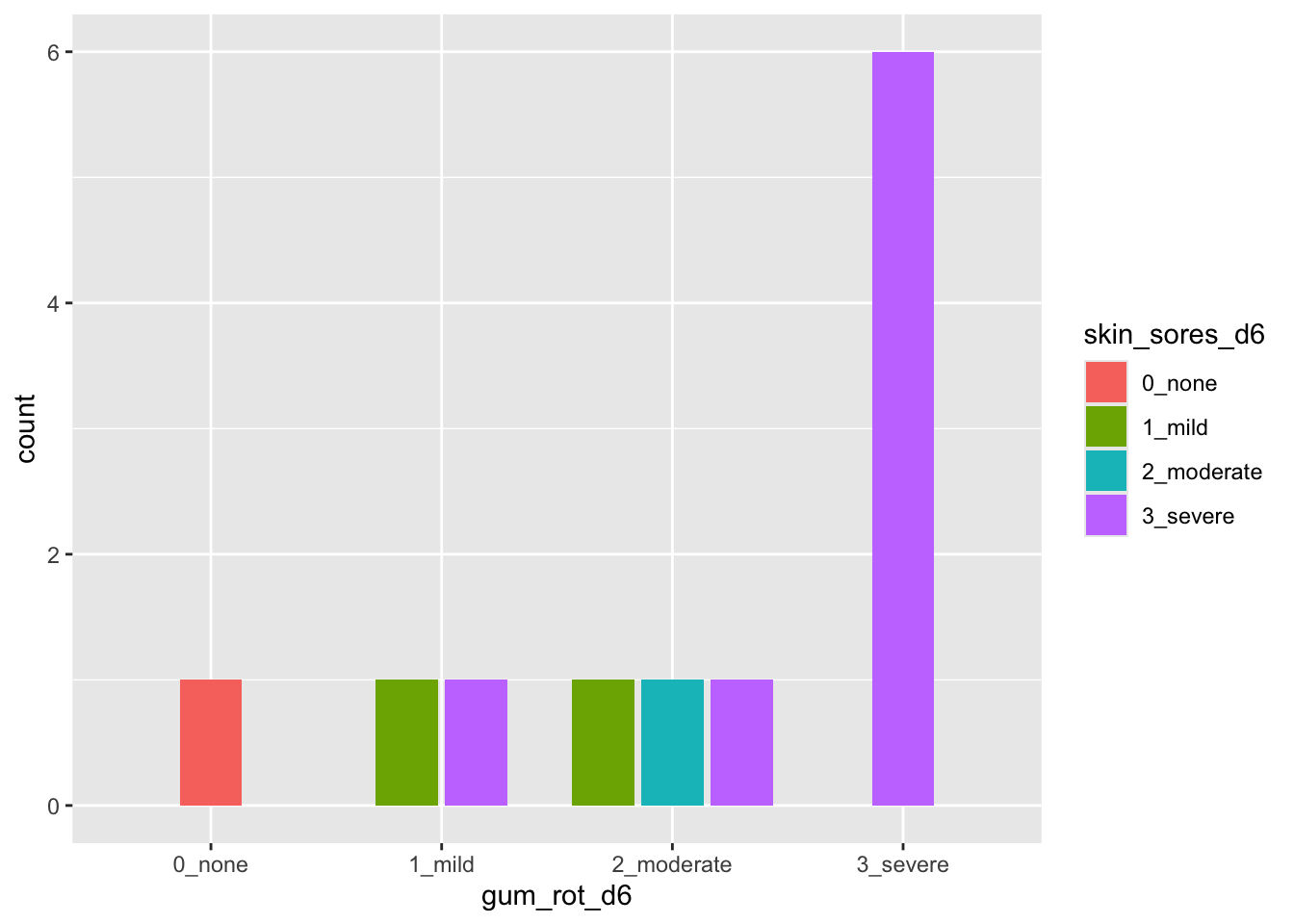
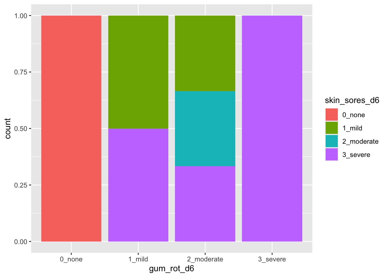
For each exercise, you will be shown the structure of the dataset and then make a targetted plot shown.
You can find more details about the dataset by looking at the documentation in your R console, e.g. enter
?agridat::crampton.pigfor information of the diamonds dataset.
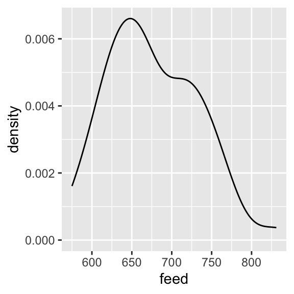
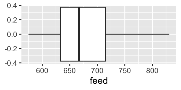
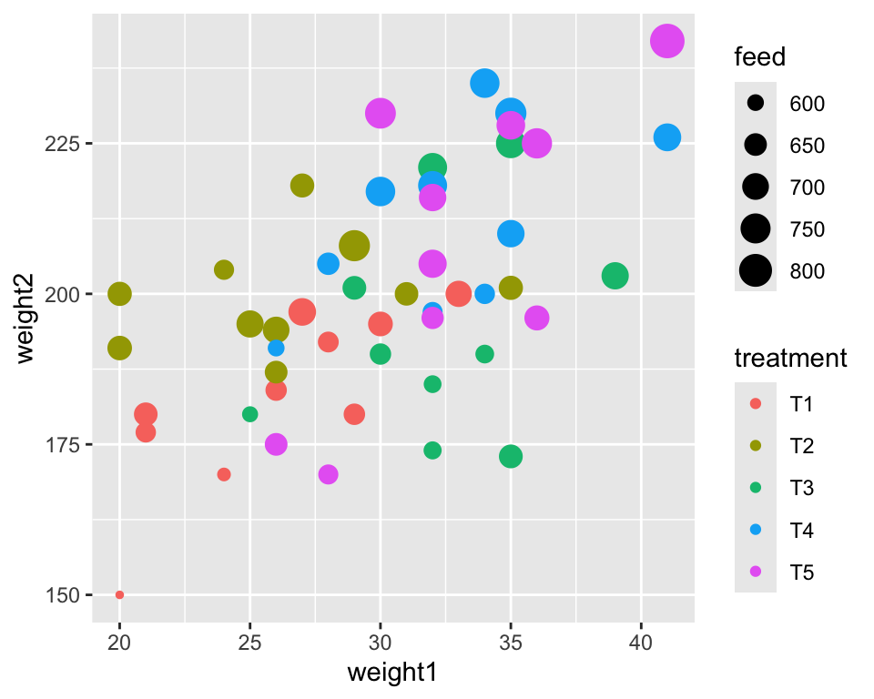
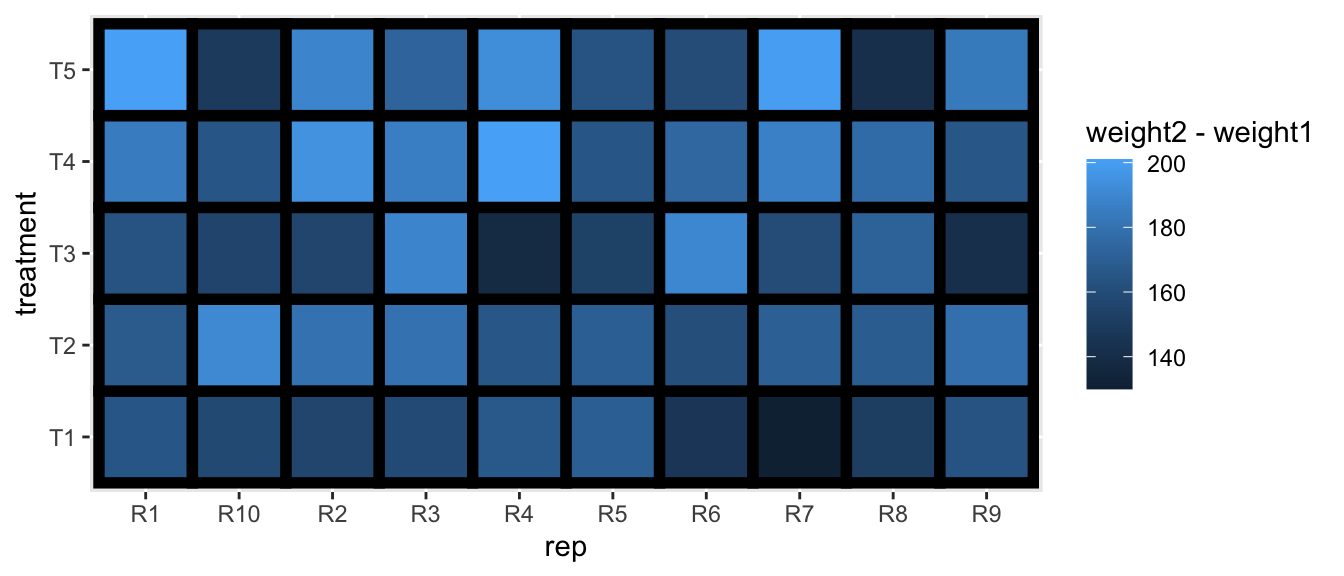
Weight gain in pigs for different treatments
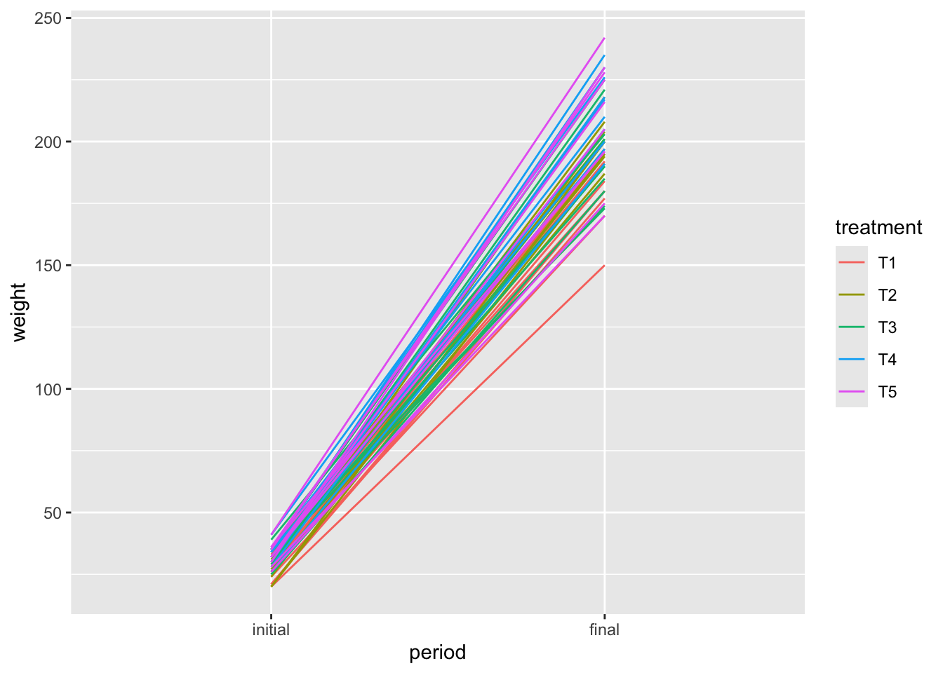
This is a hard one! The data needs to be reshaped before plotting.
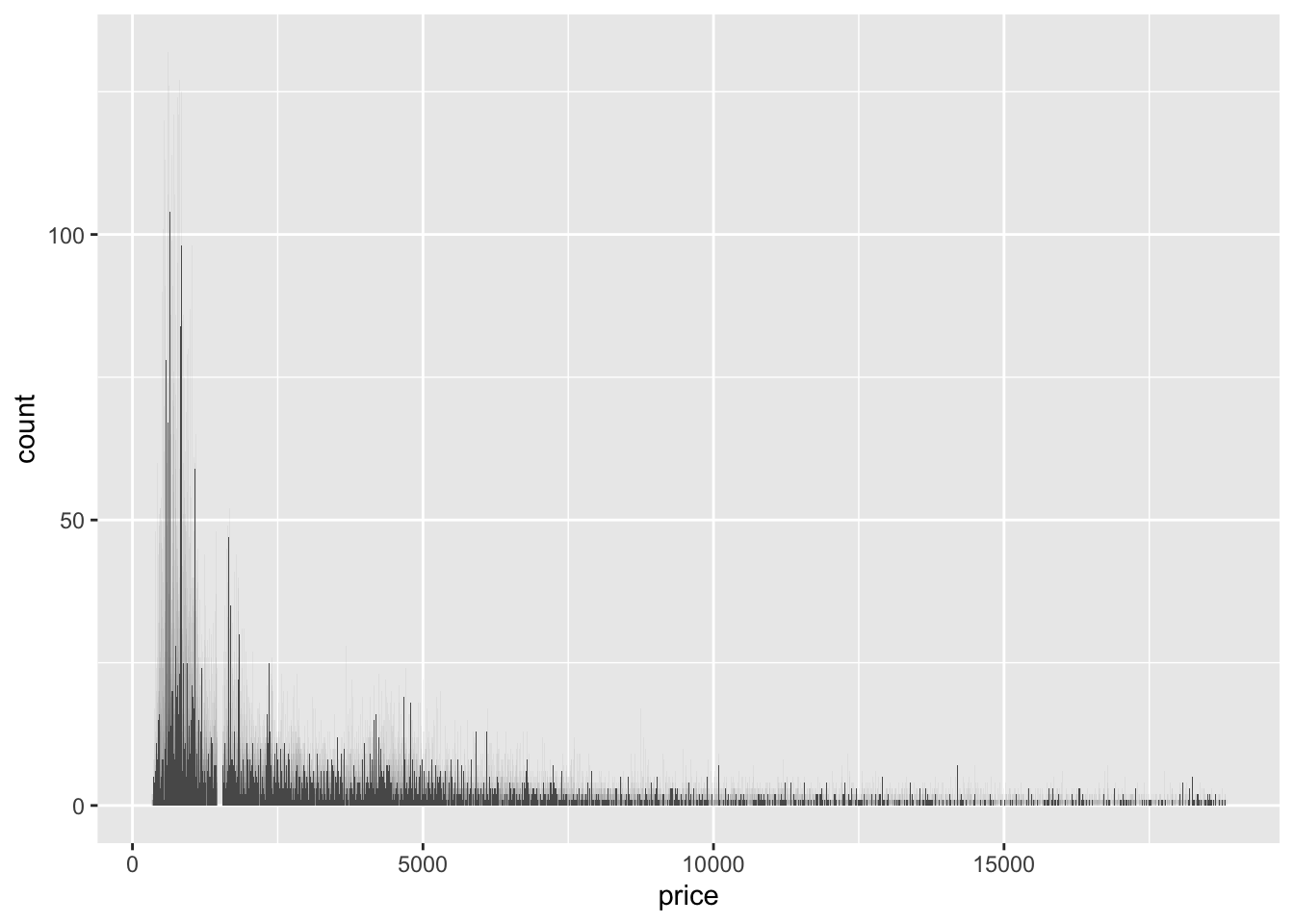
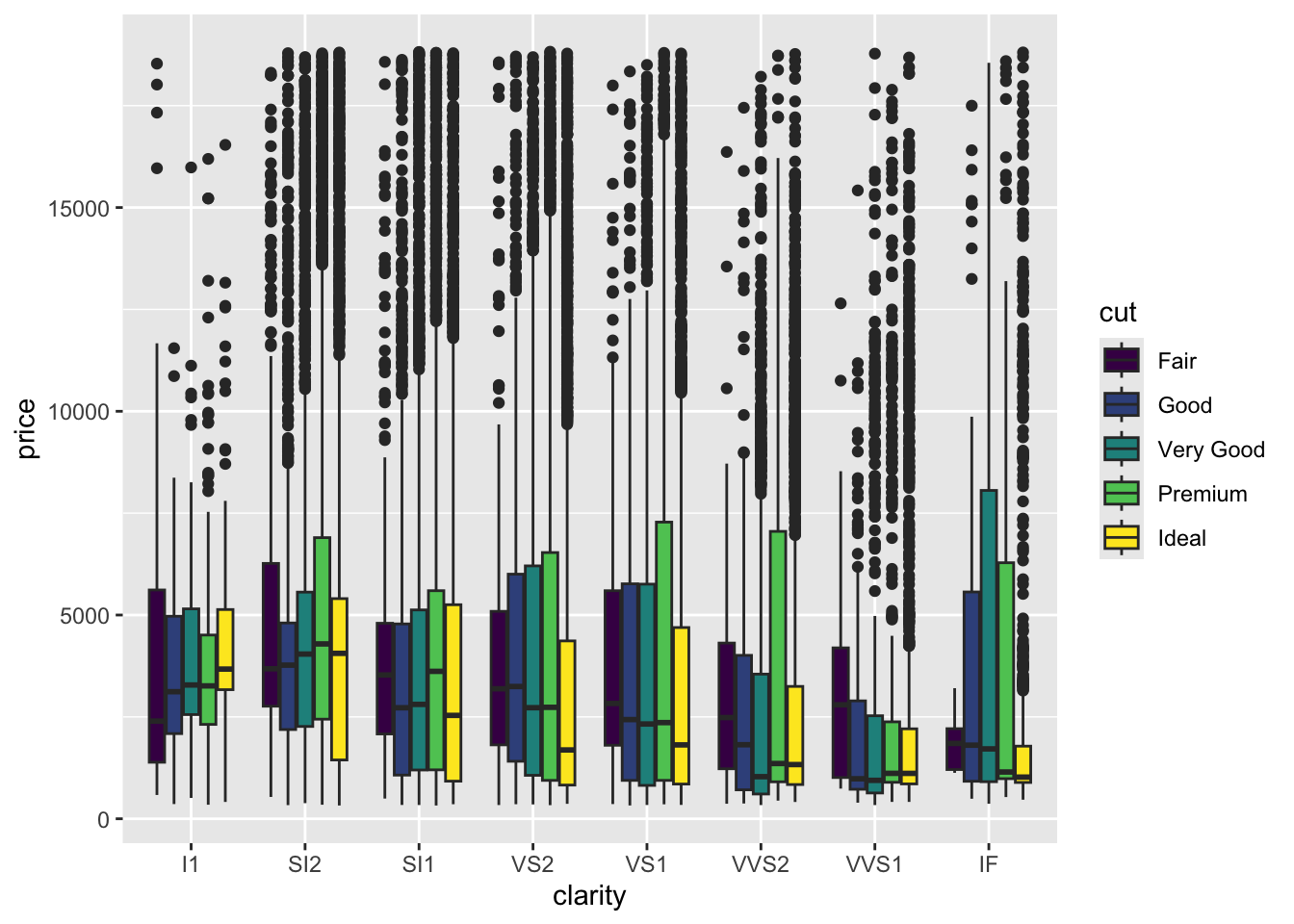
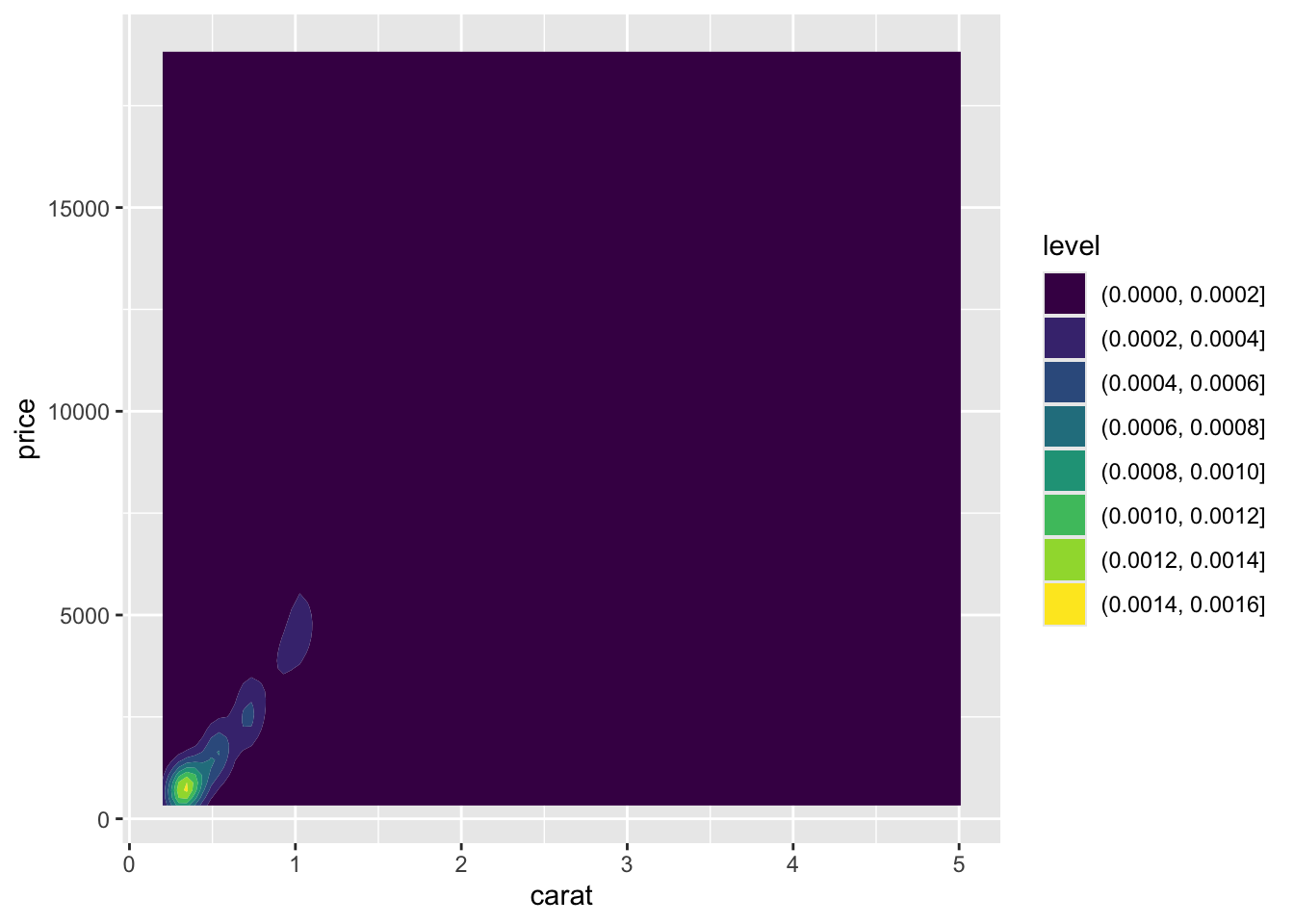
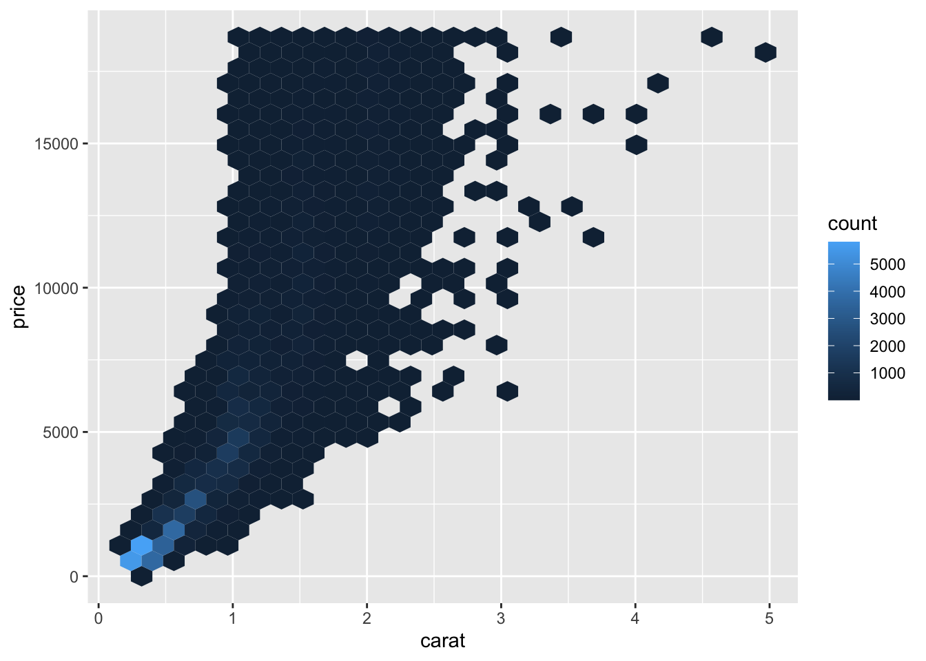
Prices of over 50,000 round cut diamonds
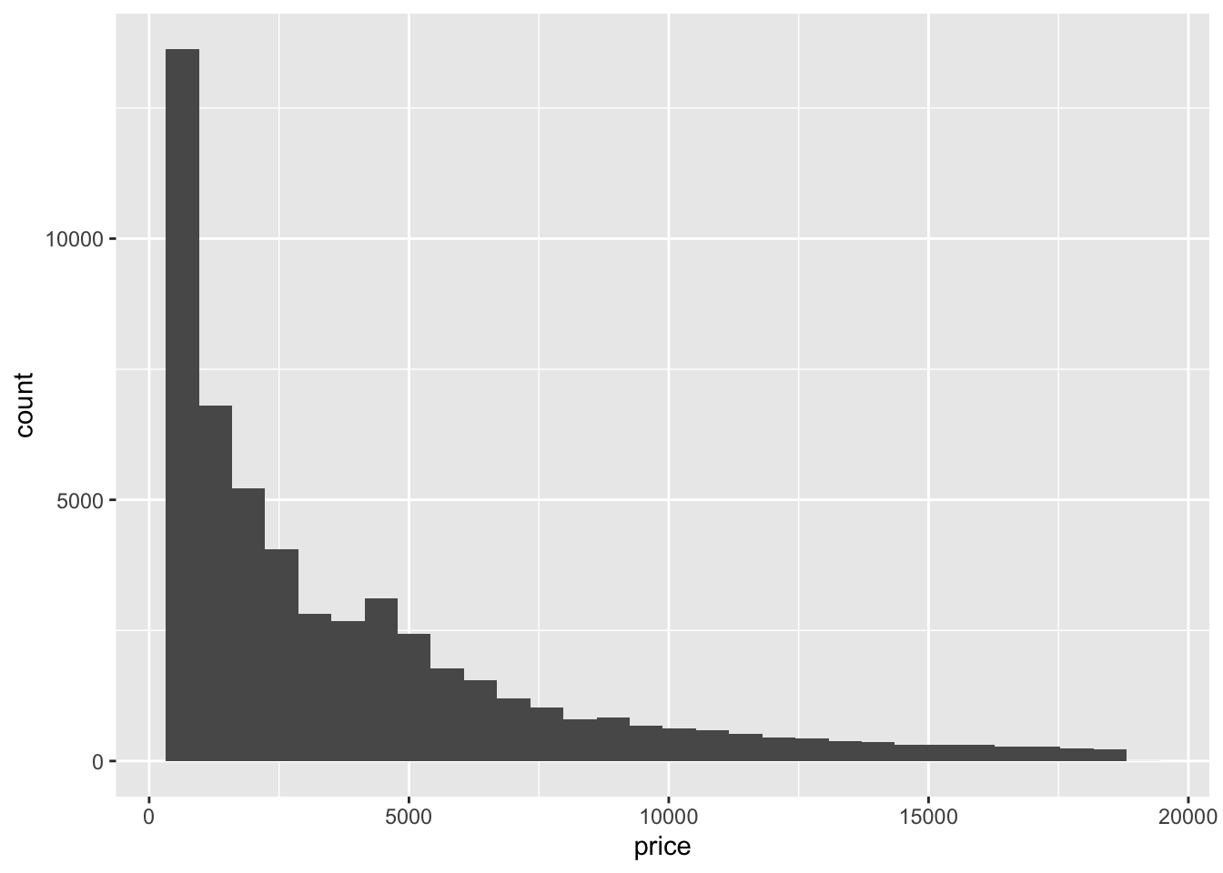
Try changing the bin width to see how the histogram changes.
Reflect on learning objectives
You should be able to:
-
Create basic plots using
ggplot2
- Once again, for each exercise make the targetted plot shown.
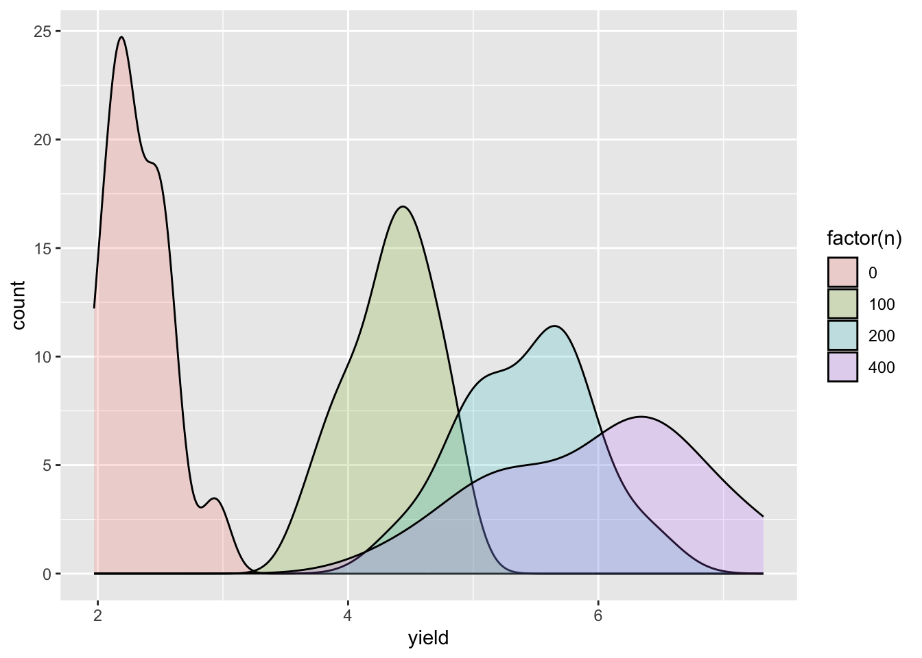
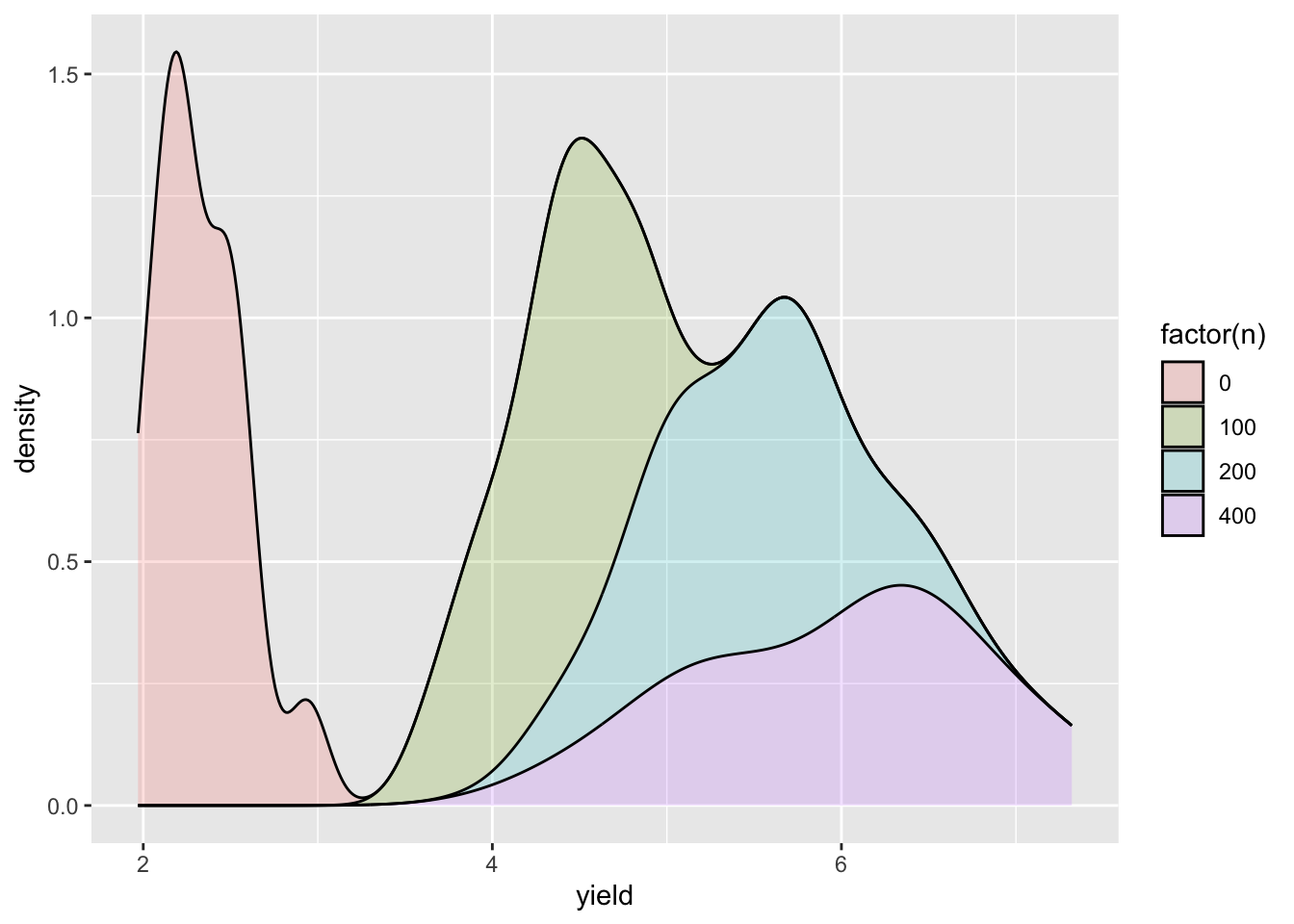
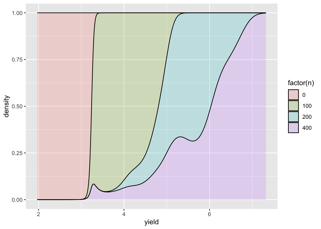
Factorial experiment of bermuda grass with nitrogen (n), phosphorus (p), and potassium (k) fertilizers

Now try changing the y-axis so it shows count instead of density.
Now make the position adjustment so the density is stacked.
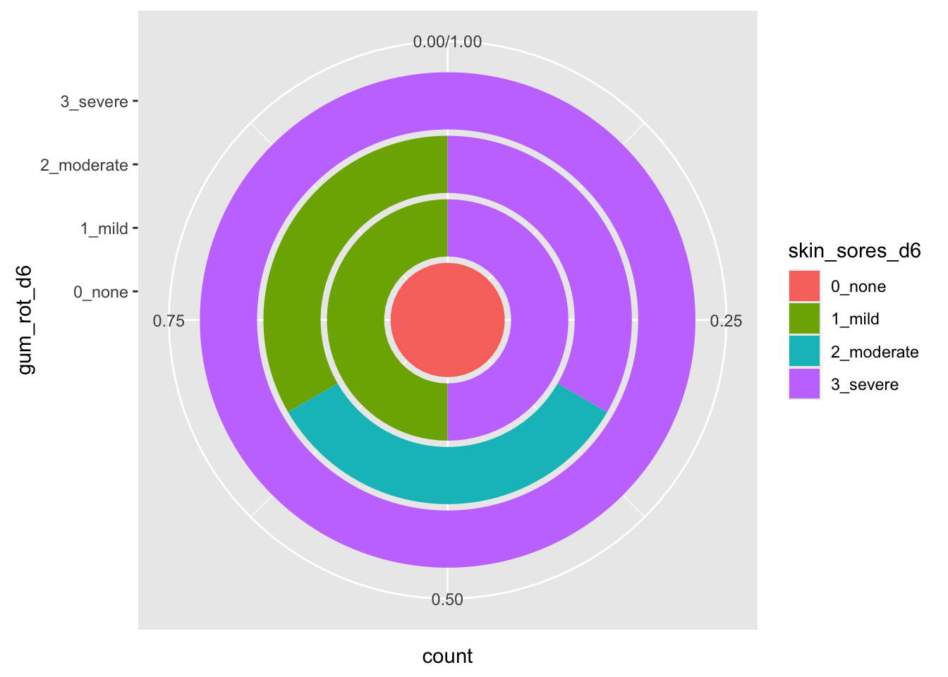
Adjust the position to show the density as a proportion of the total across the yield like the graph below.
Randomized Trial of Six Therapies for Scurvy
Reflect on learning objectives
You should be able to:
- Understand the concept of the grammar of graphics
- For each exercise, wrangle the data in the format required then draw the targetted plot required.
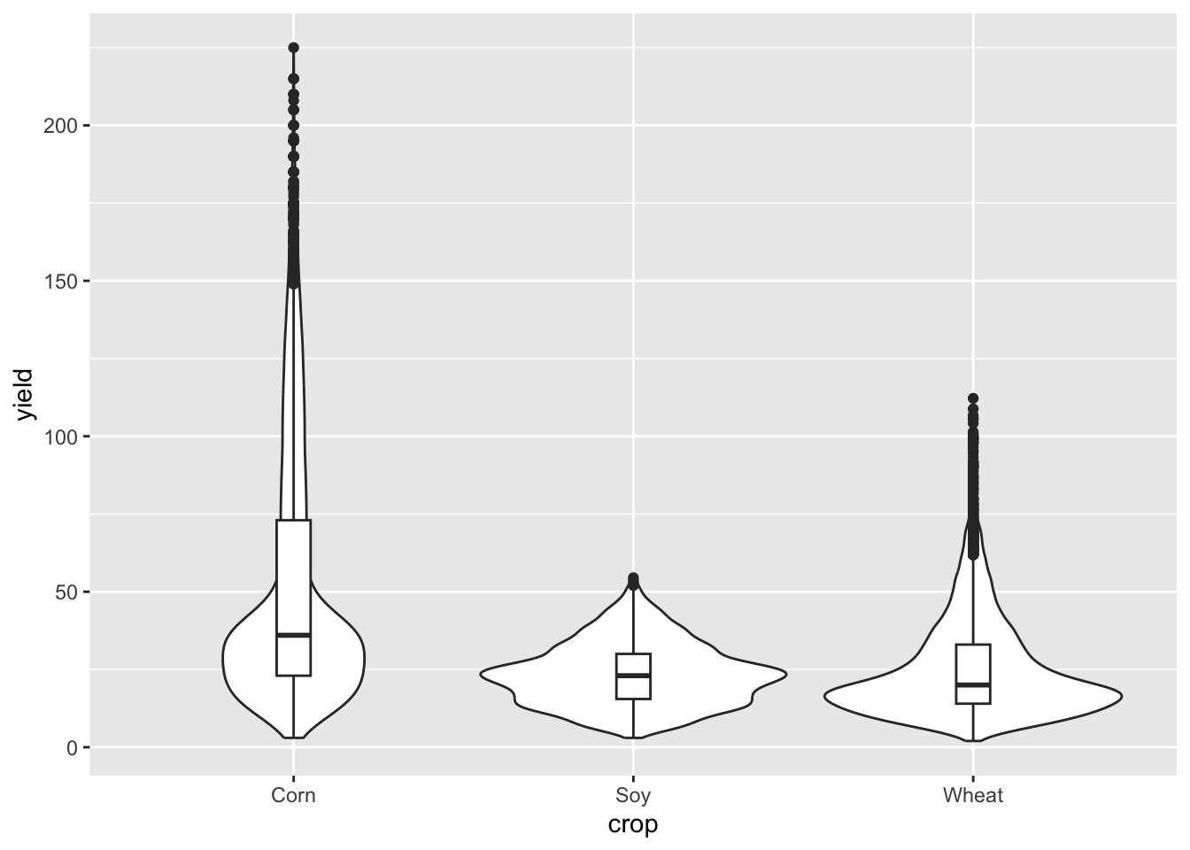
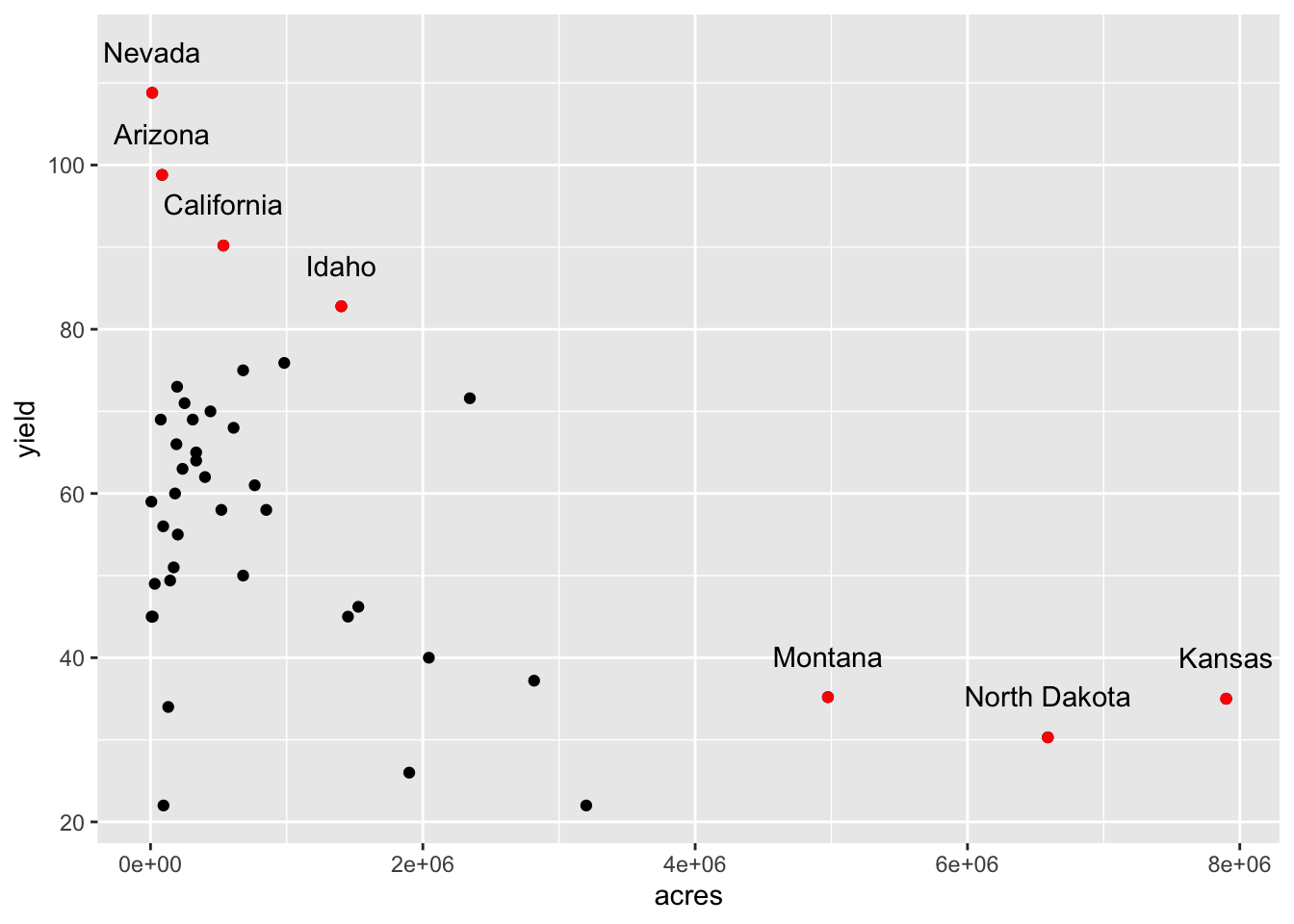
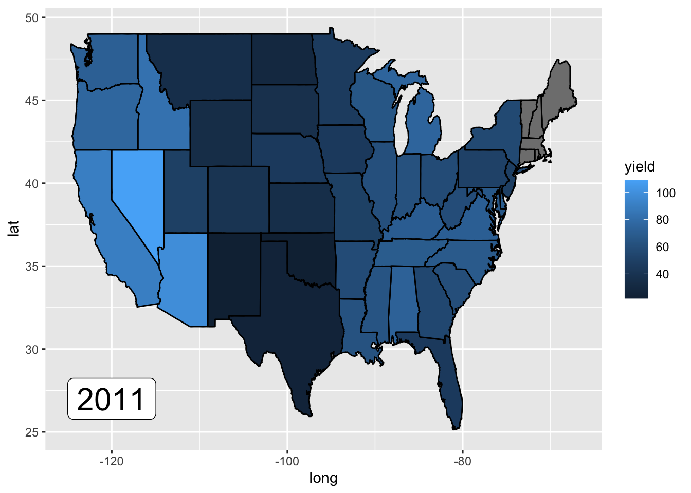
U.S. historical crop yields by state
Reflect on learning objectives
You should be able to:
-
Construct plots with multiple layers in
ggplot2